The good news? There's actually a sweet spot that works for almost everyone. Whether you're printing for kids, teens, or adults, you don't need a different design file for every single size. In most cases, one well-chosen dimension works beautifully across the board.
Here's the thing though: you need to think about your smallest and largest shirt sizes before committing. A design that looks perfectly balanced on a medium adult tee might overwhelm a toddler shirt or get lost on a 3XL. That's why knowing your range matters.
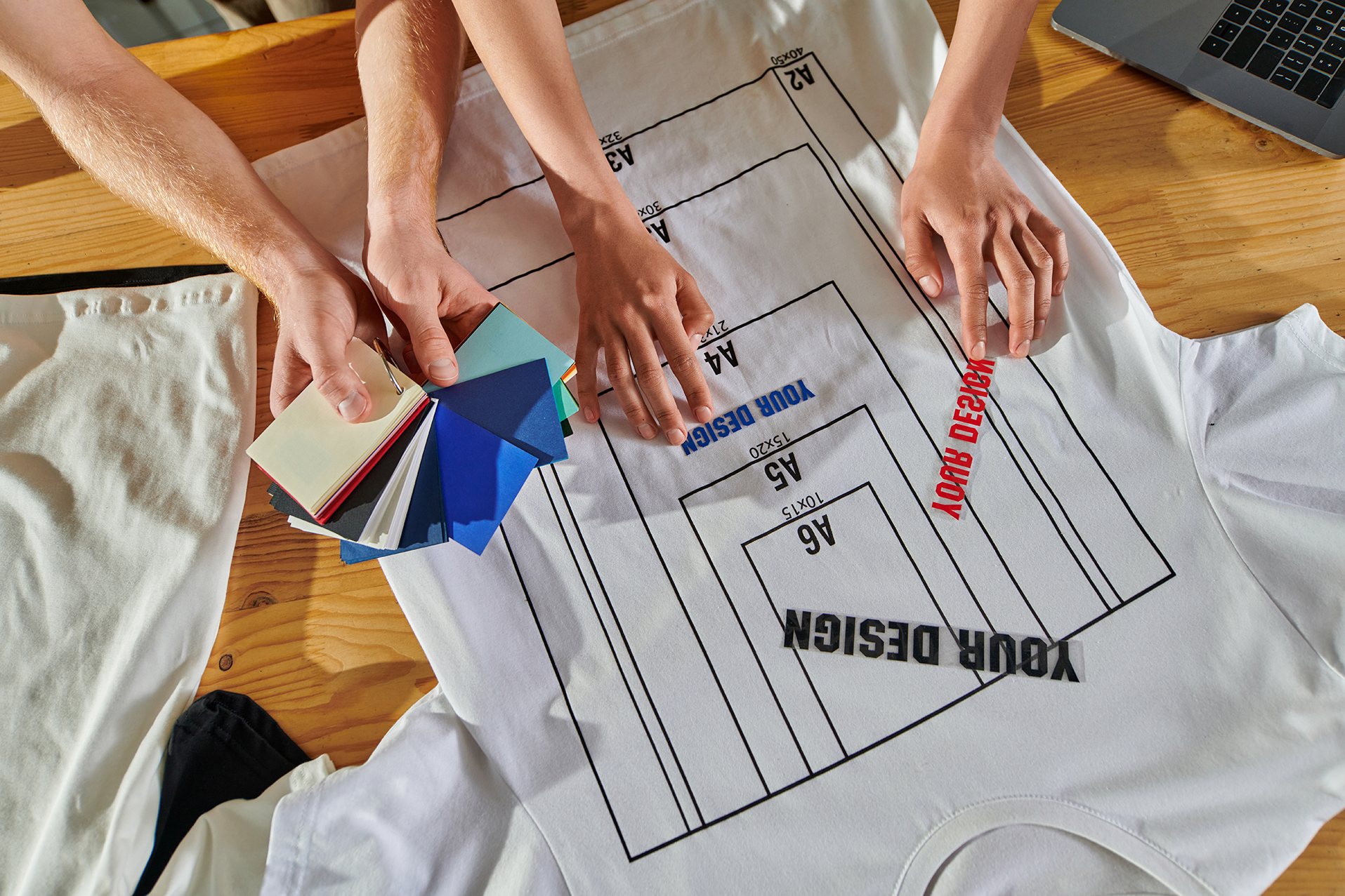
Print Sizes That Actually Work (By Age Group)
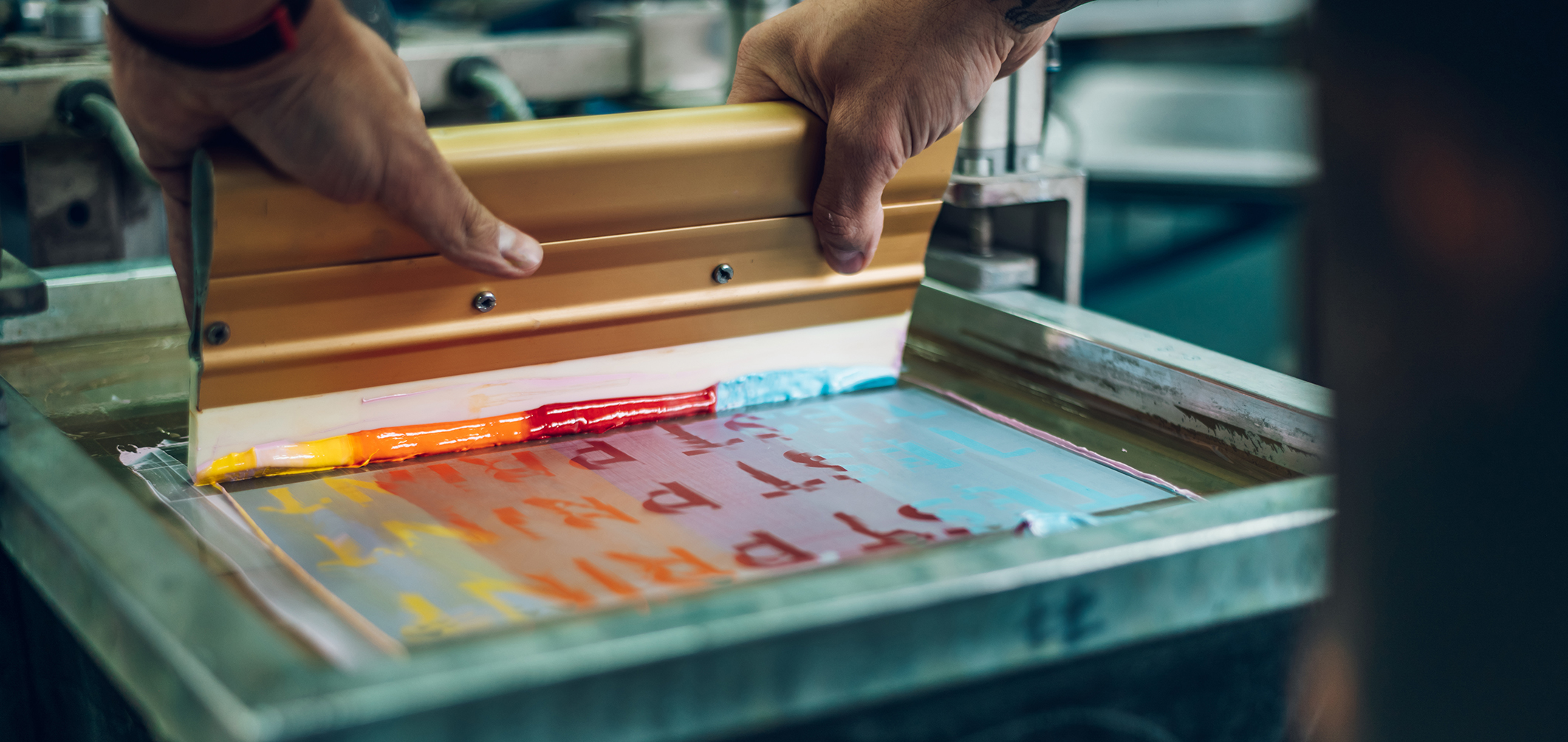
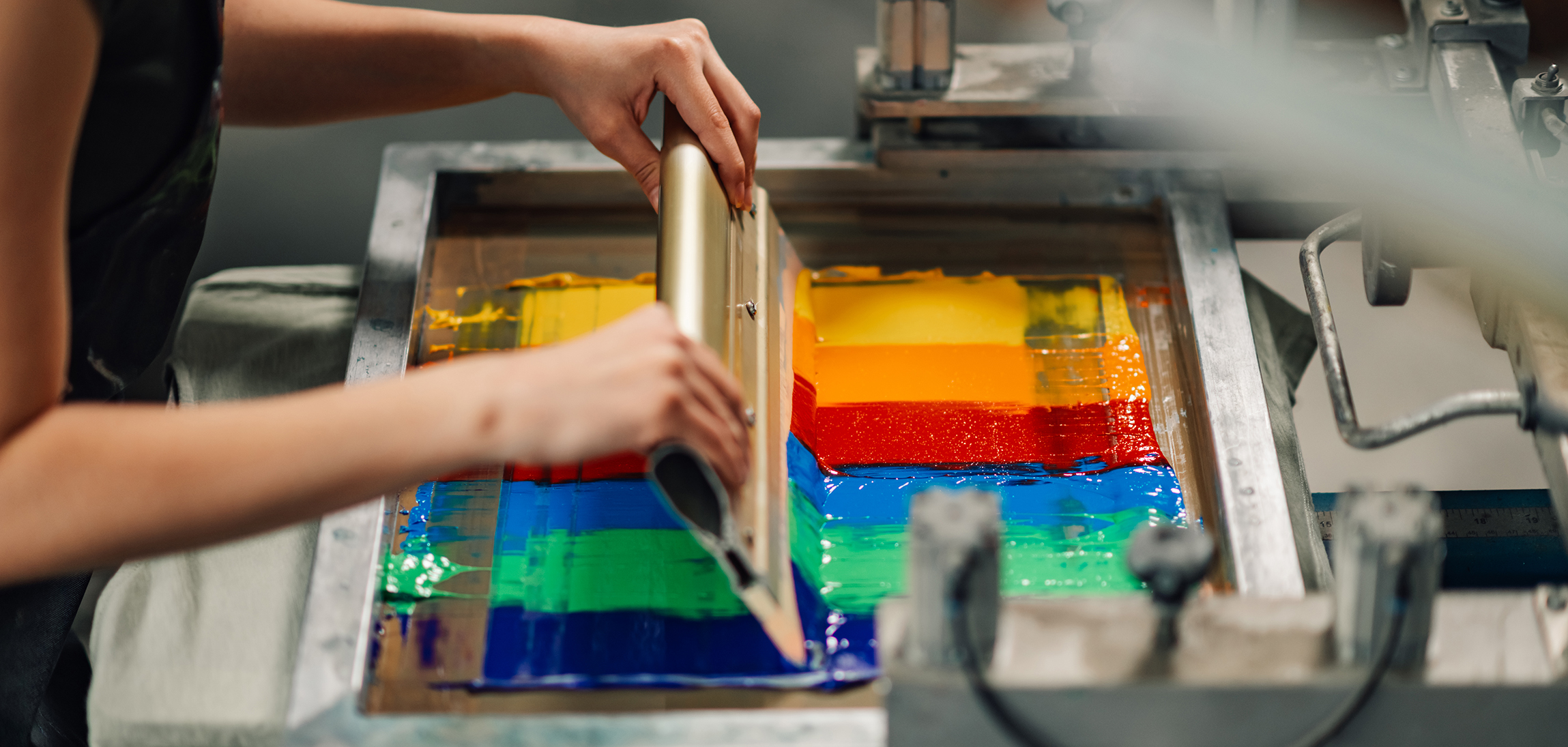
We've tested this stuff over thousands of orders, so here's what we recommend based on real-world results:
| Who's Wearing It | Shirt Sizes | Recommended Print Size |
|---|---|---|
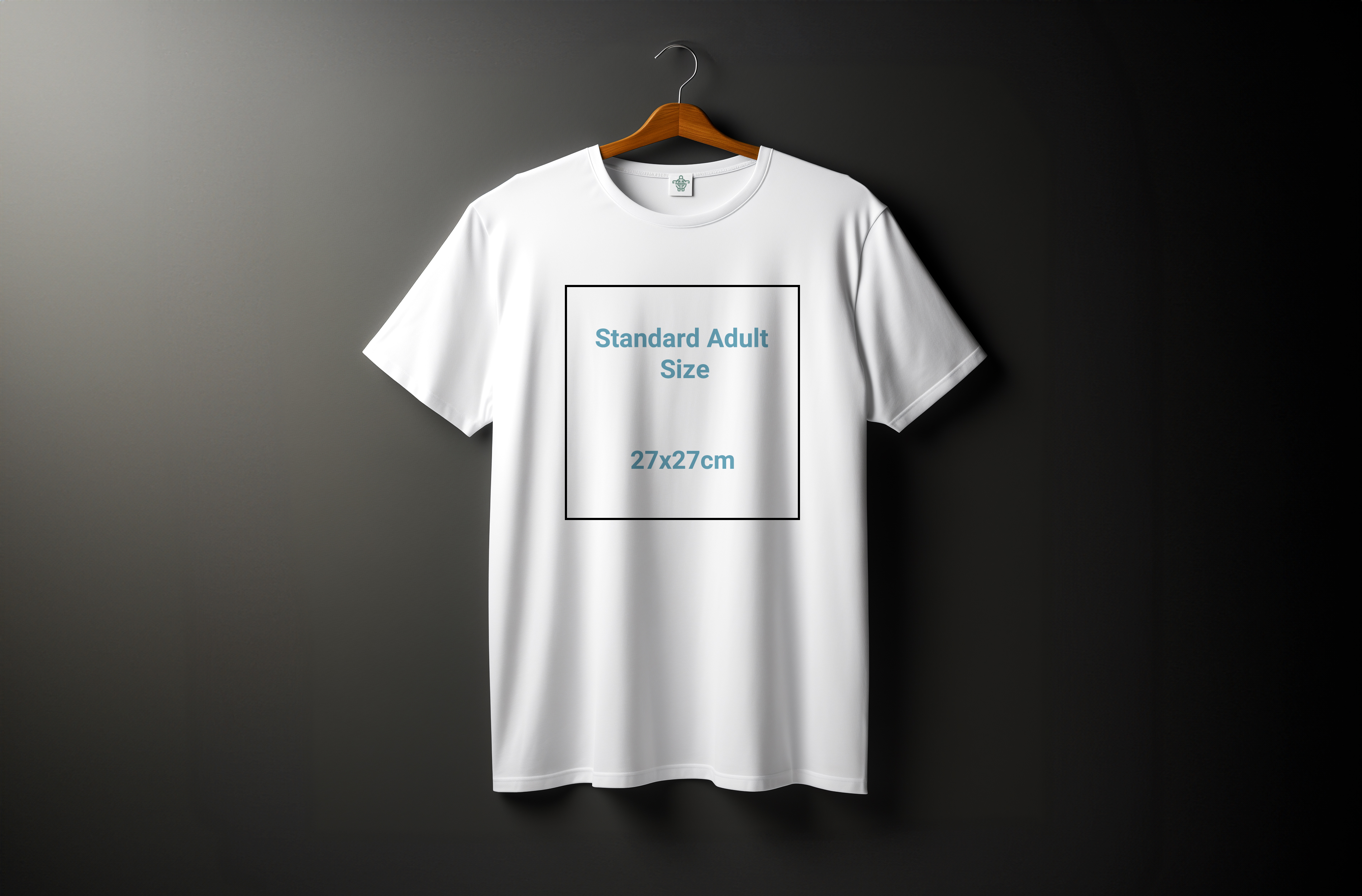
| Adults (Larger Sizes) | XL, 2XL, 3XL | 27×27 cm |
| Adults & Youth | S, M, L | 26×26 cm |
| School-Age Kids | 8, 10, 12, 14 (XS) | 21×21 cm |
| Toddlers | 2T, 4T, 6T | 14×14 cm |
Notice how there's some overlap? That's intentional. A 26 cm print looks sharp on a youth large and an adult small. You're not stuck creating five different versions of the same logo.
Where Should the Print Actually Go?
Alright, so you've nailed the size. But here's where things get tricky: placement. I've seen gorgeous designs completely ruined because they sat too high (hello, awkward neck proximity) or too low (welcome to belly button territory).
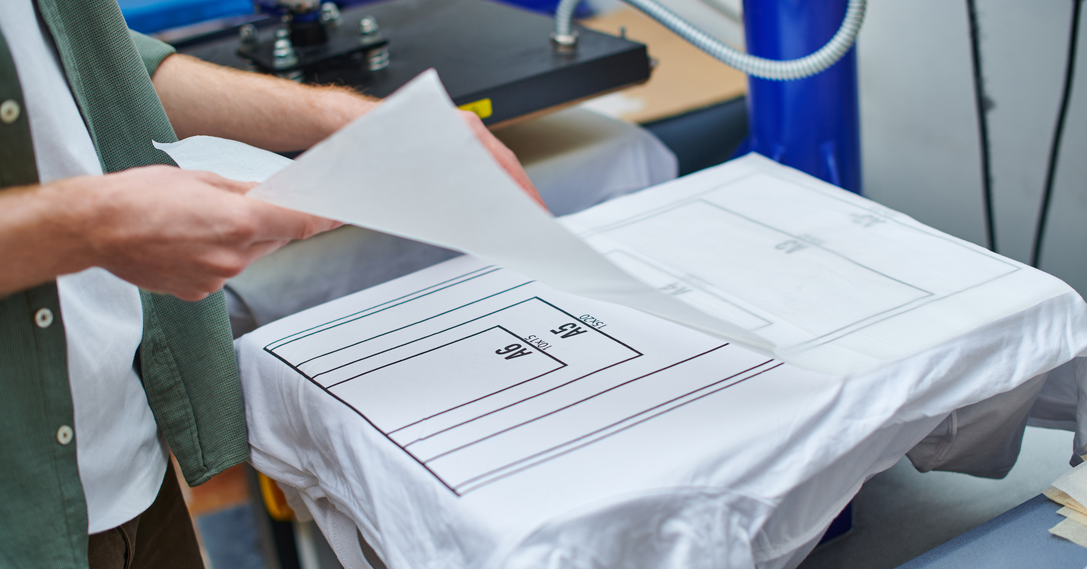
Chest placement is king. It's classic, it's versatile, and when done right, it looks like it came straight from a retail store. The standard positioning? About 5–7 cm below the collar seam, dead center.
The Placement Cheat Sheet
- Medium to large graphics: Position 8–10 cm below the neckline and center it perfectly on the chest
- Oversized or statement graphics: Drop it down to 10–12 cm below the neckline so it doesn't feel cramped
Here's a pro tip: bigger doesn't always mean lower, but if your design has a lot going on visually, giving it a bit more breathing room from the collar helps it stand out without feeling crowded.
Let's talk about centering, because this is where amateur printers mess up constantly. You'd think it's simple, right? Just line it up with the middle of the shirt and you're done.
Wrong.
The actual center of a t-shirt is not where the seams are. It's not based on the sleeves. And it's definitely not eyeballed.
Professional printers find the true vertical center by folding the shirt in half and aligning the design to the body's midpoint — ignoring everything else.
Here's what happens when you don't do this: the print drifts slightly off-center, and even though it might only be a centimeter or two, your brain notices. It looks sloppy. It screams "homemade" in the worst way.
Good printers always:
- Fold the shirt vertically to find the exact center
- Align the artwork to the body's true midpoint
- Double-check before pressing to avoid any shift during curing
The Final Word (Our Go-To Standard)
📏 8–10 cm below the neckline, perfectly centered on the body.
That's it. That's the formula we use for premium apparel printing, and it works every single time. It keeps your design in the natural visual zone of the upper chest — exactly where it should be — without creeping too close to the collar or sagging toward the midsection.
Whether you're printing one shirt or a thousand, nail these two things — size and placement — and you're 90% of the way to a professional-looking product. The other 10%? That's the quality of your print itself, which is a whole other conversation.